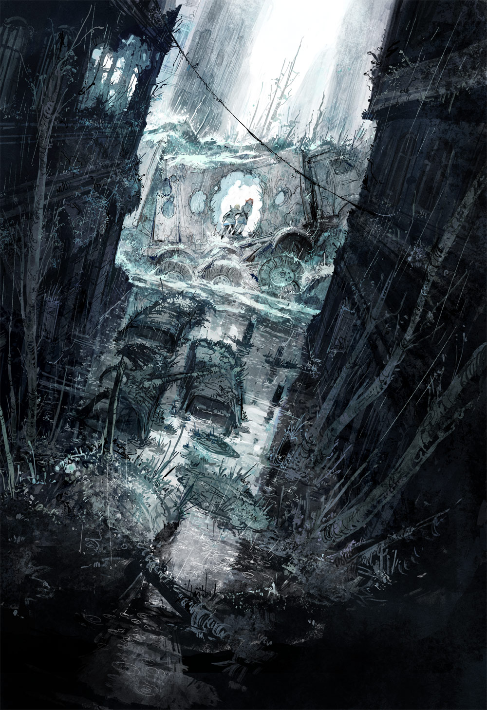

Aaaand done. Phew, this page I'm happy with, turned out the way I wanted, in the time that I wanted, a good page to end the week on. ;3. And hey, I happened to actually save the primary sketch for this page because I did it a bit differently than I usually do, which would be a line drawing sketch. But for landscapes and big effect panels where getting the lighting correct is key I usually go for a value sketch, like this:
As you can see the original intent was to also have two small panels overlapping the bottom of the page, but I changed my mind after finishing the top of the page and decided that this one would look much better as a big standalone splash page panel. The little bottom panels got moved to the beginning of Monday's page instead, I just have to rearrange the sketch of that one a little bit to make them fit.
See you next week, and happy first of May/Valborgsmässoafton/Vappu to everyone!