Composing a comic spread rather than a page.
It's a joyful week, because I've sent the A Redtail's Dream book off to the printers where it's going to be inspected for any formatting mistakes over the next week. Which means the first big part of labour for the print drive is over! The next part will be to draw all the original artwork for people, and the final one is the shipping of the books next year.
Today's journal post is related to the process of putting together the book in Indesign. It's about the layout issues that made me very disgruntled with some of the spreads that I ended up with, as I had drawn each page individually rather than thinking about how it would look with another one next to it. Here's the three main issues that I ran into with aRTD, and which I've made sure to correct in SSSS. They're simple details that are easy to implement if one does it from the start, so they're good to keep in mind for those of you guys who are thinking of perhaps making your own comic one day.
1. A consistent baseline
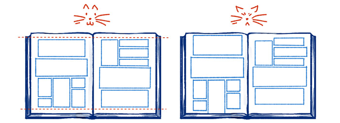
A couple journal posts ago I showed how I had completely failed to incorporate bleeds and margins into the first half of aRTD. This is a bit similar: I never decided how far away from the edges panels should be, I just drew whatever with my ruler, so I ended up with some pages where panels were hugging the bottom edge but far away from the sides and vice versa.
There doesn't need to be a baseline on two or more sides in order for the panels to be grounded on the spread, just having one straight, consistent edge will make everything look less sloppy overall when someone flips through a comic book. A straight bottom edge will act like a "floor" or sorts that the art can stand firmly upon, while making the left and right sides line up will instead give the feeling of two walls keeping it all together in the center.
For SSSS I've actually decided to use the strictest kind of framing: all four sides are completely straight and aligned on a typical page. I'm partly mimicking the composition style of the central European comics that I used to read as a child, and having a calm composition like that will also make future "special" or action-y pages with crazy panel arrangements stand out even more. It's basically the same reason why I avoided using slanted panels in aRTD for anything but the most intense action parts.
2. Matching panel grids on opposing pages
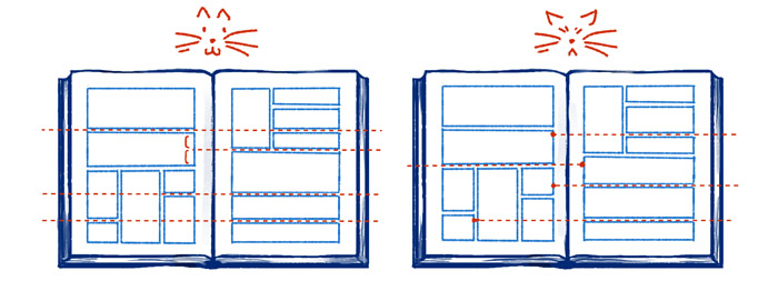
A beginner's lesson in composing a comic page is to figure out some kind of panel grid for the page, which can simply mean that you make gutters either line up perfectly with other or make them not line up in a very calculated way (like at the 1/2 or 1/3 mark of the adjacent panel). When designing a full spread, you should make sure to expand that grid idea to engulf both pages of the spread.
Of course going overboard with strict grids can make things look unnecessarily rigid, but they should be used when it doesn't make things worse. The one awful thing to definitely avoid is panel gutters that almost align, but not quite. They're off-putting and very noticeable the same way that tangents are, and often they end up looking like someone tried to make the gutters match up, but was too sloppy and missed the mark.
3. Balancing the art style and composition
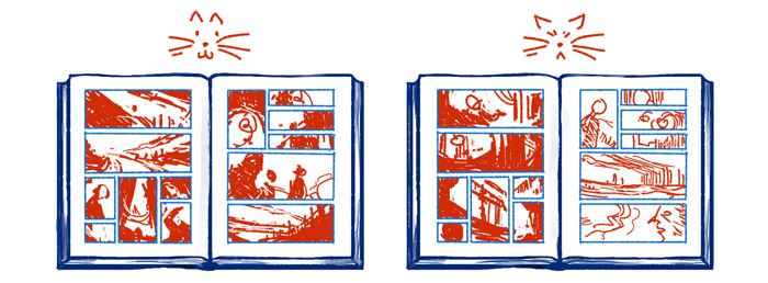
Last but definitely not the least we've got the issue of balancing the artwork of the opposing pages. Even when they don't have overlapping panels or some other kind of joint elements, pages should look like they do belong together. Colors, the level of detail, line weights and the balance between white and black are all things that need to work together as a whole to create a spread that would look pleasant to look at in a book.
Sadly, In aRTD I ended up with a lot of pages that just don't fit together art-wise. I'd have one page where I decided to use a lot of heavy black areas, and then for the next page I was in a lighter mood and drew it accordingly. Or I'd use heavy marker lines and bold shading on one page, and then more delicate lines on the next one. Of course the idea of aRTD was for me to try out different ways to draw the lineart, but if I could go back and do it all over I'd make sure to not try something else right in the middle of a spread. Thankfully the colors are quite uniform since I actually did the coloring of the pages in pairs, they simply fit so neatly on my screen that way.
A couple of general things to keep in in mind
Where does the page number go? You'll probably want to have page numbers for your comic to make it easier for your reader to navigate the book, so remember to decide where you want to have that little marker for the printed version and leave a proper amount of space for it.
Avoid panels with repetitive composition. This is another beginner rule for a single comic page, but it goes for the full spread too. The human brain will automatically connect two shapes that look very similar, so two similar panels on opposing pages should have a good reason for being similar, and therefore strongly connected to each other. I noticed a couple of pages in aRTD where I ended up with a shot of either Hannu or Ville with pretty much the exact same facial expression and composition on opposing pages, and it simply looks repetitive and off-putting, like I ran out of new things to draw so I just drew the same panel again.
~~~
That's my little observations after making one comic and starting another one. And if any of you have ever come across something in comic page compositions that you thought was either problematic or a nifty way to solve something, I'd love to hear it! I'm sure I'll keep running into annoying little mistakes I've made once it's time to put together the first SSSS book, maybe after that I'll have another hindsight post like this to share.
Comments powered by IntenseDebate - create an account or login if you don't want to comment as a guest.